There’s something so freeing about creating just to explore—and these two practice abstract sets were exactly that. No pressure, just color and curiosity leading the way.
Both are made up of four mini abstracts using the same mix of watercolors, acrylics, pens, pencils, and bits of collage—yet they each took on a completely different mood.
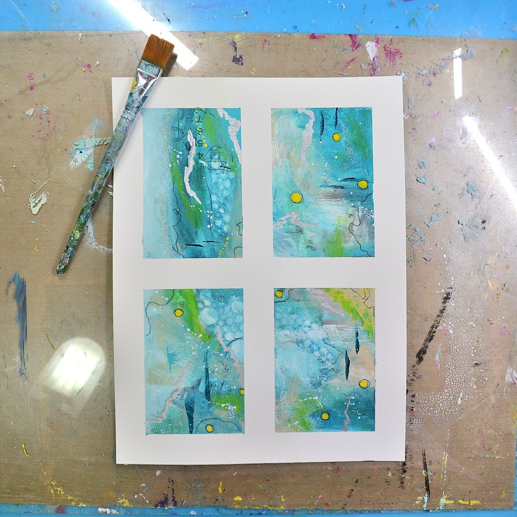
Cool, Calm Ocean Blues
The first set leans into soft blues and greens, inspired by the gentle rhythm of the ocean. The colors flow naturally, with subtle texture and small pops of green, yellow and light that feel peaceful and soothing.
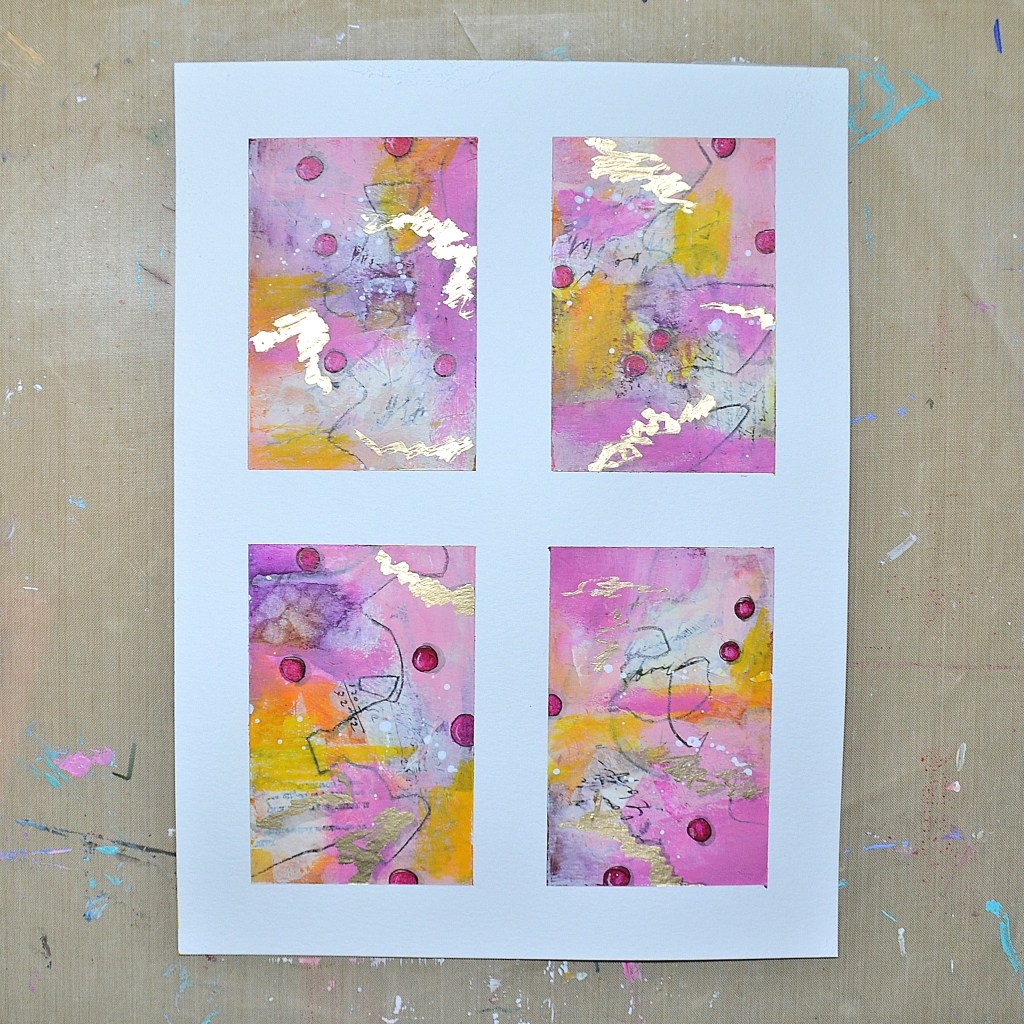
Warm, Playful Pinks
The second set is full of warmth and energy, with vibrant pinks, touches of orange, and hints of gold. Layered marks, playful movement, and a bit of shimmer give these pieces a lively, expressive feel.
Same Process, Different Personalities
I love how the same materials can lead to such different results. One calm and flowing… the other bright and full of energy.
It’s a beautiful reminder that creativity doesn’t have to be perfect—just showing up and playing can lead to something unexpected and joyful.
Which one speaks to you more—the calming blues or the playful pinks?
Thank you so much for stopping by. Wishing you a happy, colorful, and wonderful day ✨
Share the Happy❤️
