
There’s something about spring that feels like a fresh start. The colors return, the light shifts, and as artists, we naturally begin reaching for softer, brighter palettes.
Spring colors do more than look pretty—they carry mood and emotion.
Soft pastels like blush pink, lavender, and baby blue bring a sense of calm and renewal. They feel gentle and peaceful, like a quiet moment to breathe. Fresh greens, on the other hand, are full of life and possibility. They remind us of growth and new beginnings—like something beautiful is just starting to unfold.
Yellows add warmth and light. Even a small touch can lift a painting and bring a sense of joy. And those playful pops of coral, peach, and bright florals? They invite a more free, expressive approach—encouraging us to let go and enjoy the process.
What I love most is how the colors we choose often reflect how we’re feeling. Sometimes we lean into soft, calming tones, and other times we crave bold, energetic hues. There’s no right or wrong—it’s all part of the creative journey.
So next time you’re creating or even just observing a painting, pay attention to the colors that catch your eye. They may be quietly speaking to your mood.
Thank you so much for stopping by and spending a little creative time here with me. Wishing you a colorful and inspiring day!
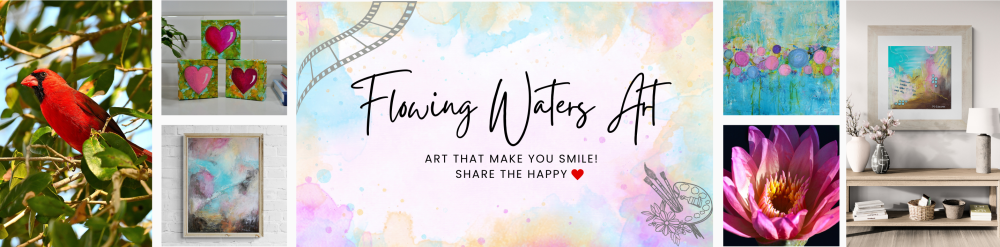
Share the Happy 💖
