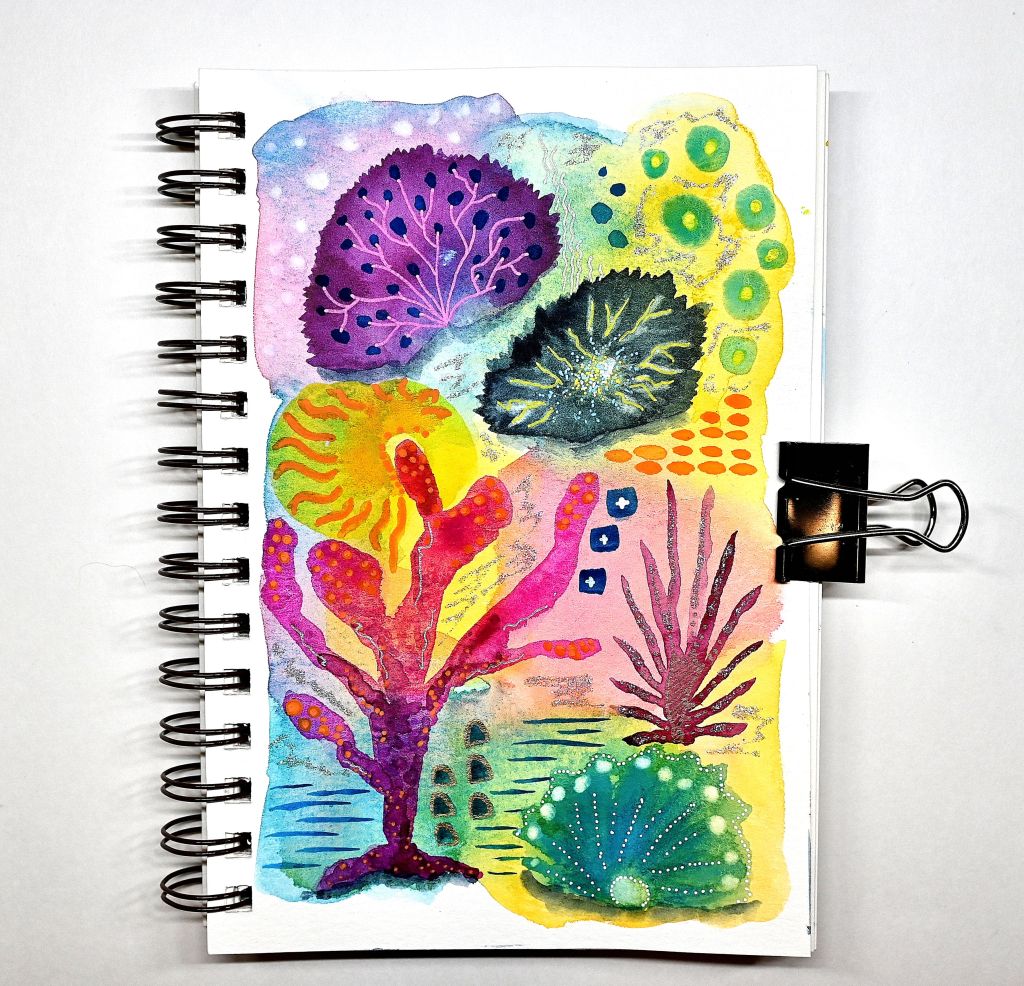
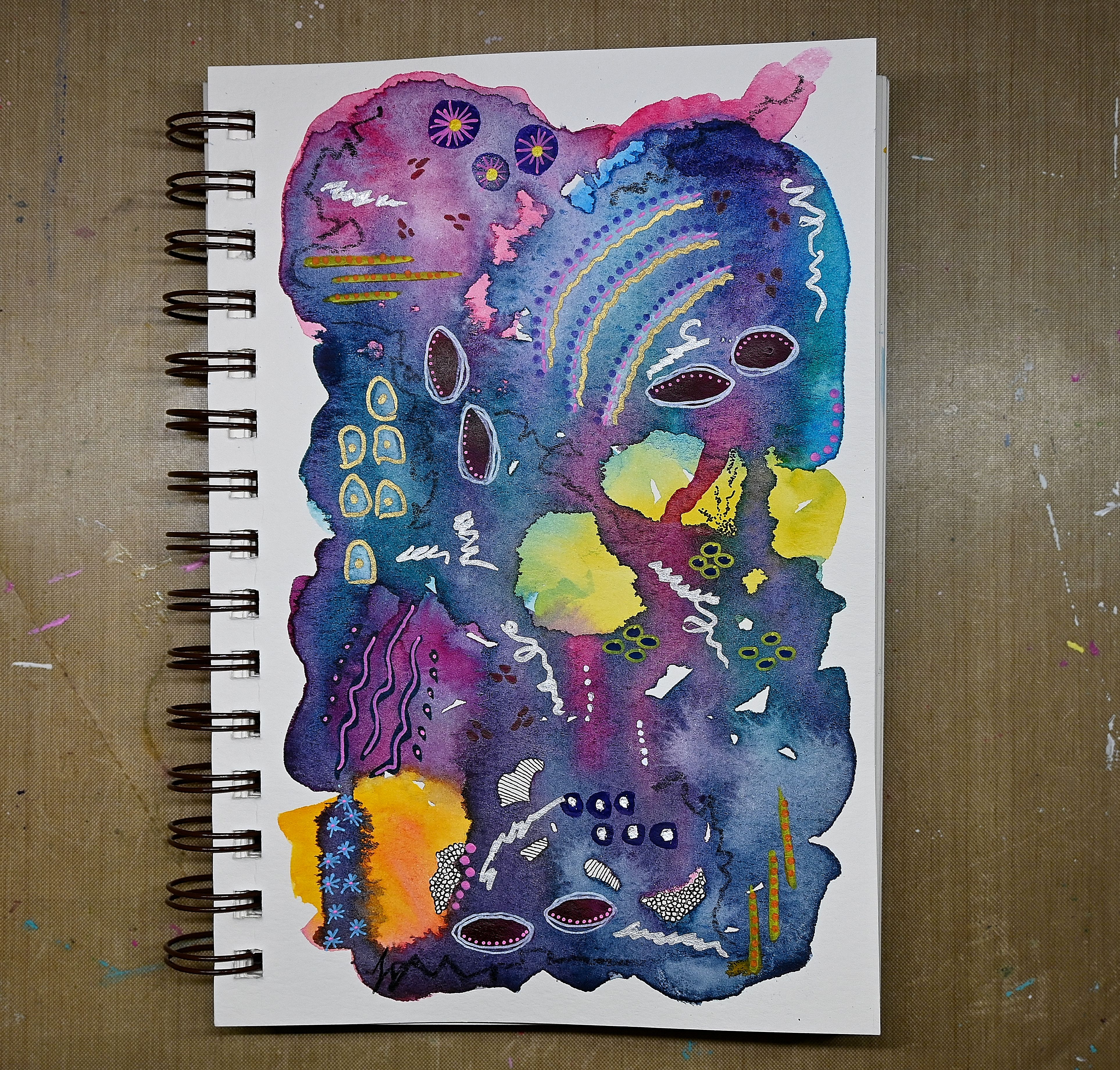
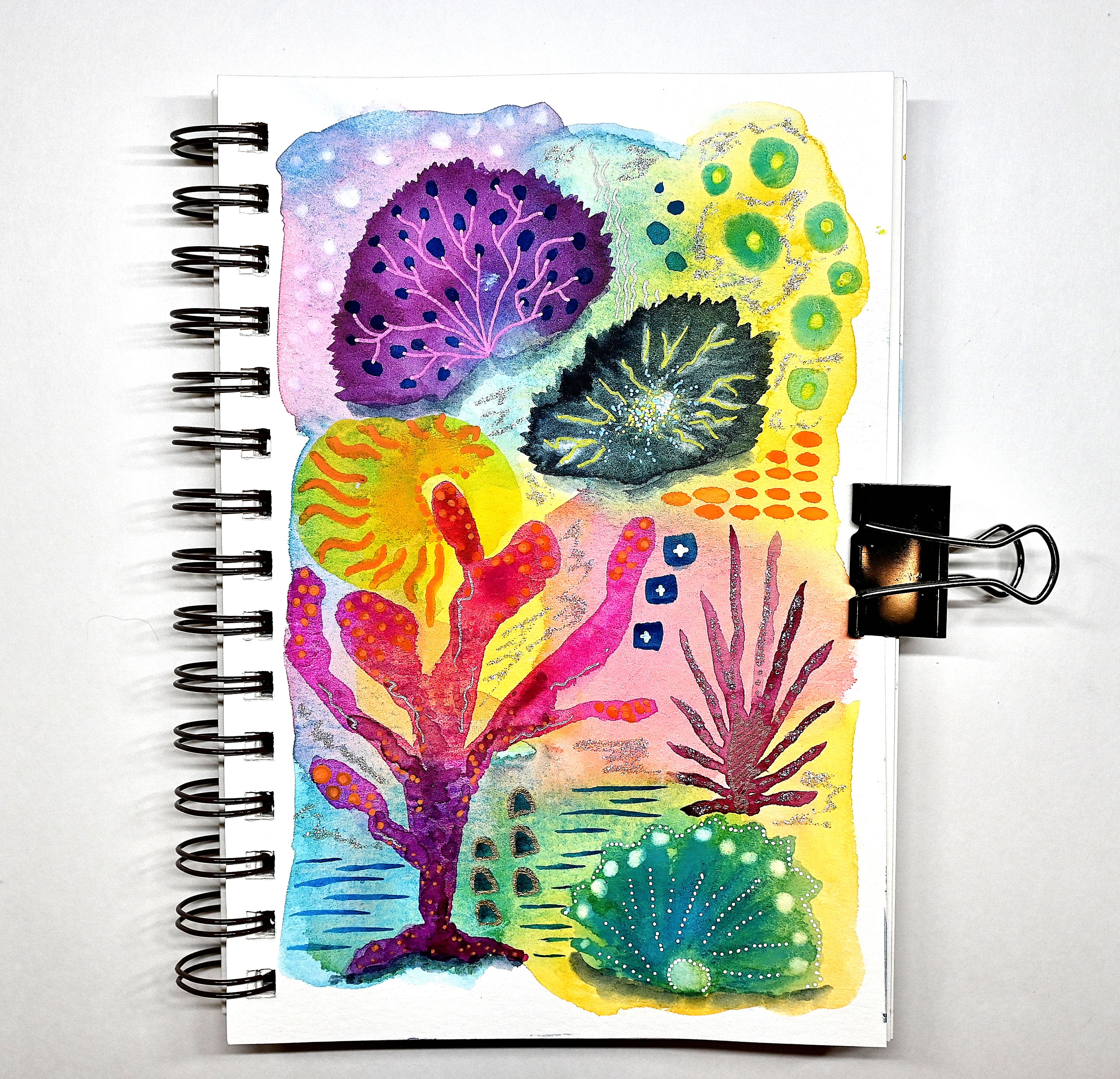
I decided to try something a little different in my 5.5×8.5″ watercolor journal. For this practice painting, I worked mostly with darker watercolors (shown above-left) instead of my usual brighter palette (shown above-right). I love how bold it turned out and how the brighter colors really pop against the deeper tones.
What didn’t quite meet my expectations was the neon-colored paint pens I used—they didn’t stand out as much as I’d hoped. One challenge with watercolor abstracts is that the paint moves and lifts when wet, which can cause those vibrant colors to get a bit muddied.
Still, it was a great practice piece, and I enjoyed the process. That said, I definitely prefer a lighter, brighter background for my work. How about you—do you lean towards bold and dark, or light and bright?
I hope this inspires your creative muse this weekend! Thanks for stopping by!!
Share the Happy 💖
“Creativity is seeing what others see and thinking what no one else have ever thought.” ~Albert Einstein