Exploring the Magic of Accordion Art Journals

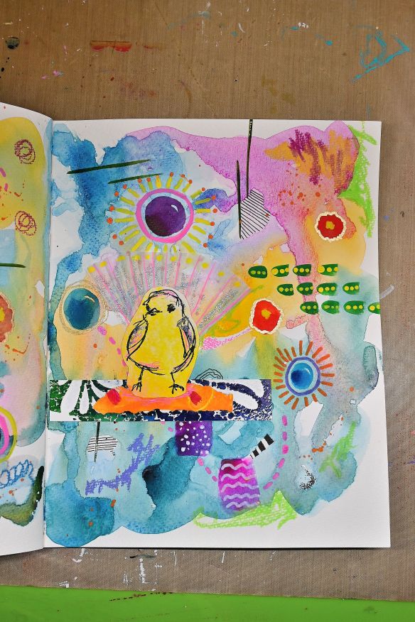
There’s something uniquely delightful about working in a handmade journal and letting creativity spill across the pages. Lately, I’ve been diving into my very own and first, accordion-concertina art journal, that is part of the Art Sparks online course by the ever-inspiring Joanne Sharpe (@joannesharpe). If you’ve ever taken one of her classes, you already know how her imaginative approach fuels fresh ideas and brings your creative energy to life. If not, I can’t recommend her courses enough—every lesson feels like a personal invitation to play.

My first few journal pages are coming to life with vibrant layers of color, cut-out flowers, and collaged whimsical shapes—all brought together with two delightful little pockets tucked into the left and right sides. While I might go back and add a few more details here and there, I’m giving myself the gift of time—letting the ideas simmer, evolve, and grow organically. This slow, joyful approach is a beautiful reminder that art doesn’t always need to be rushed. It’s not about the finish line; it’s about what we learn along the way.

What’s stood out to me in this process is how art journaling builds a daily habit of learning. Each time I sit down, I discover something new—about color, composition, or even my own creative moods. Sometimes it’s a technical insight, like balancing a busy page; other times, it’s simply about letting go and enjoying the moment. Art journaling invites constant exploration, and the accordion format makes it all the more playful and satisfying as it unfolds.

If you’ve never tried working in an accordion-concertina journal, I highly recommend giving it a go. The continuous flow of the pages invites new perspectives and ideas that just don’t happen in a traditional book layout. There’s something magical about seeing your artwork stretch and connect across folds—it feels alive.

Have you ever experimented with this kind of journal? I’d love to hear your thoughts in the comments below. Let’s chat!

Wishing you a wonderfully creative weekend, thanks for stopping by!

Share the Happy💖

Creative Watercolor Journal Ideas

Every now and then, a journal page comes together in the most unexpected—and delightful—way.

Take this one, for example: a colorful little abstract filled with watercolor, gouache, and some playful collage elements. The stars? Pink and yellow birds I stamped and painted myself, full of whimsy and personality. But the real surprise? Their tail feathers are made from a white cupcake liner. Yep, straight from the kitchen to the art table. Because who says cupcake liners are just for baking?

I love moments like this—when the creative process is loose, joyful, and totally unplanned. It was one of those no-rules kind of pages that made me smile the whole time I was working on it. Adding a little “kitchen magic” gave it even more charm, and reminded me just how fun it is to experiment and be playful with materials.

Now I’m curious… what’s the quirkiest thing you’ve ever added to your journal or artwork? I’d absolutely love to hear!

Wishing you a wonderfully inspired weekend, filled with color, creativity, and maybe even a few unexpected supplies. 🌸✨

Thank you so much for stopping by!

Share the Happy💖

Photo by Pixabay on Pexels.com

Watercolors vs. Gouache: Which Paint is Right for You?

Lately, I’ve been working on a small handmade journal, experimenting with both watercolors and gouache. Each medium has its own strengths, so I thought I’d share some of the perks and drawbacks of both. If you love painting, you’ve probably come across these two, and while they share similarities, their unique qualities can make a big difference in your creative process. Let’s dive into the pros and cons to help you decide which one suits your style best!

Watercolor

Pros:

  • Transparent & Layerable – Watercolors create beautiful, light washes and ethereal effects.
  • Fluid & Spontaneous – The paint flows naturally, making it great for loose, expressive work.
  • Lightweight & Portable – Perfect for travel and on-the-go painting.
  • Mixing Potential – Can achieve a wide range of colors with just a few pigments.

Cons:

  • Less Control – The unpredictability of water can be challenging to manage.
  • Lighter Colors Only – Once a dark color is down, it’s hard to lighten it.
  • Paper Dependent – Requires high-quality, absorbent paper for best results.

Gouache

Pros:

  • Opaque & Vibrant – Offers rich, bold colors with great coverage.
  • More Control – Doesn’t flow as much as watercolor, making details easier to refine.
  • Reworkable – Can be reactivated with water after drying, unlike acrylic.
  • Matte Finish – Gives a velvety, professional look, perfect for illustrations.

Cons:

  • Less Flow – Doesn’t have the same natural blending effects as watercolor.
  • Can Crack When Thick – If applied too heavily, it may crack when dry.
  • Not as Portable – Tends to be heavier and requires a palette for mixing.

Which One Should You Choose?

If you love soft, translucent layers and effortless blending, watercolor might be your best bet. If you prefer bold colors and a more forgiving medium, gouache is a great choice. Why not experiment with both and see what suits your style?

Which one do you prefer—watercolor or gouache? Let me know in the comments!

I hope you found this helpful—thanks for stopping by!

Share the Happy💖