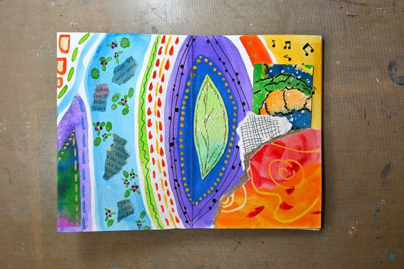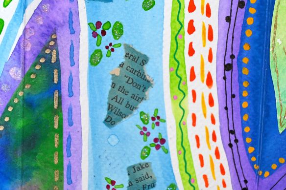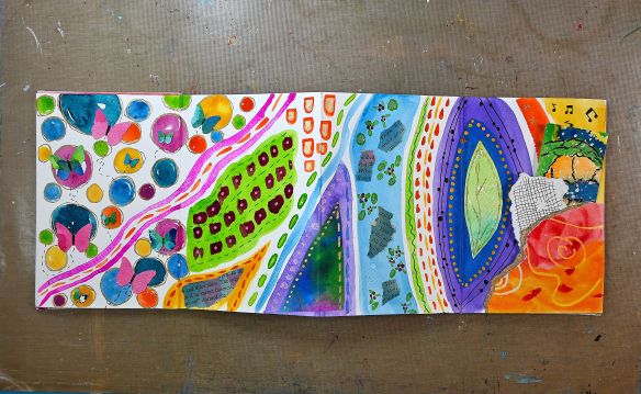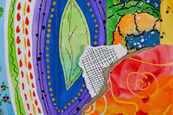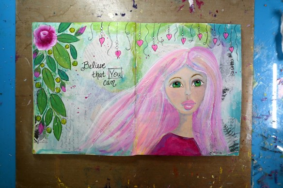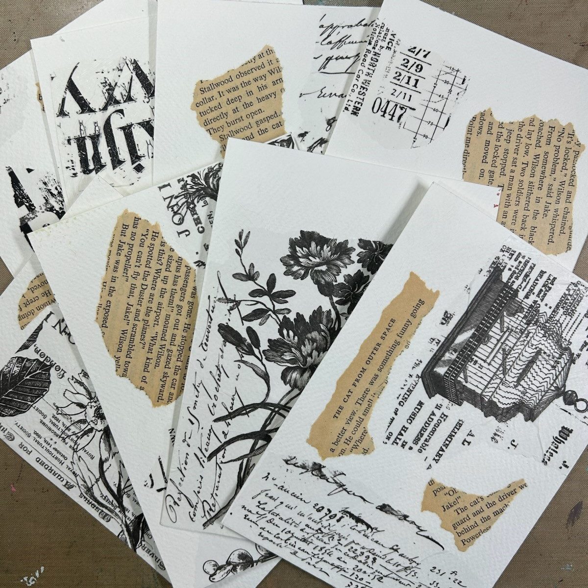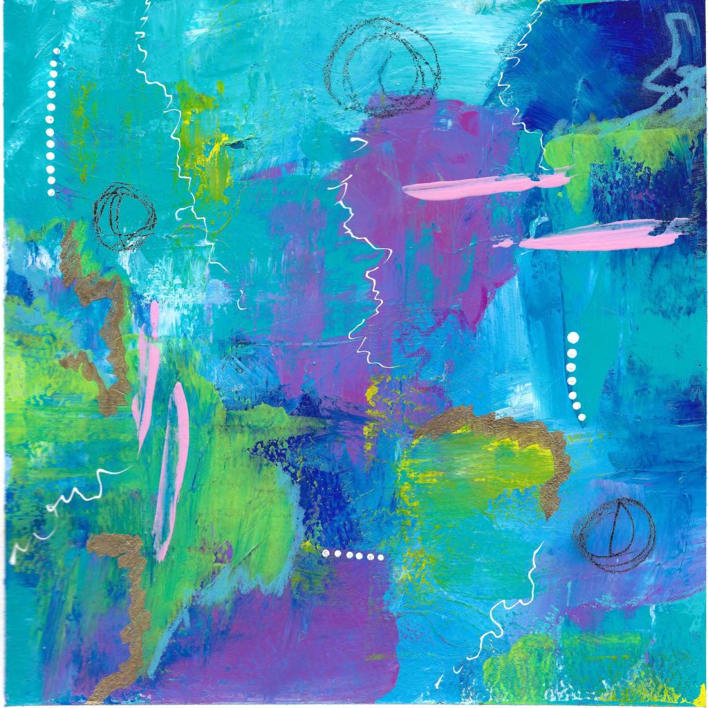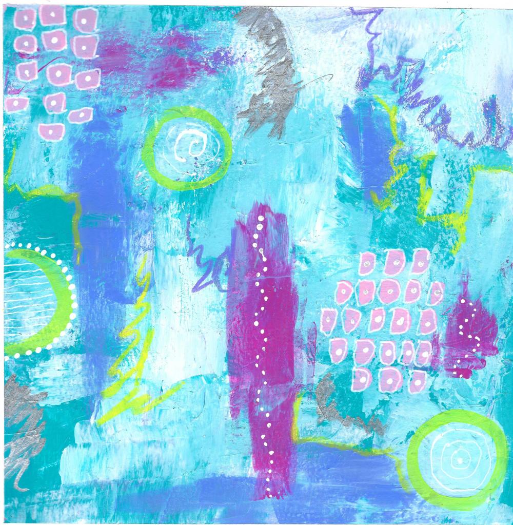
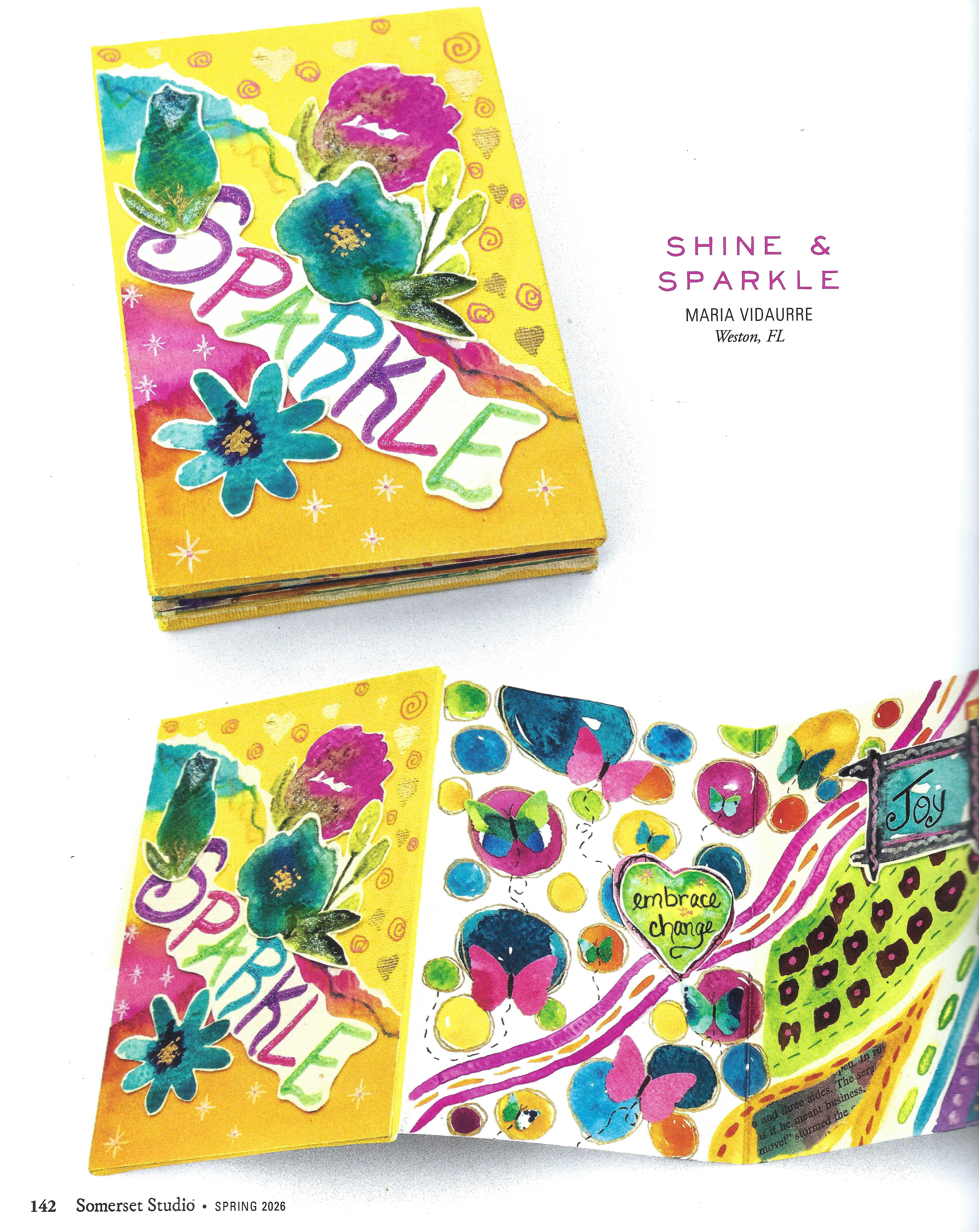
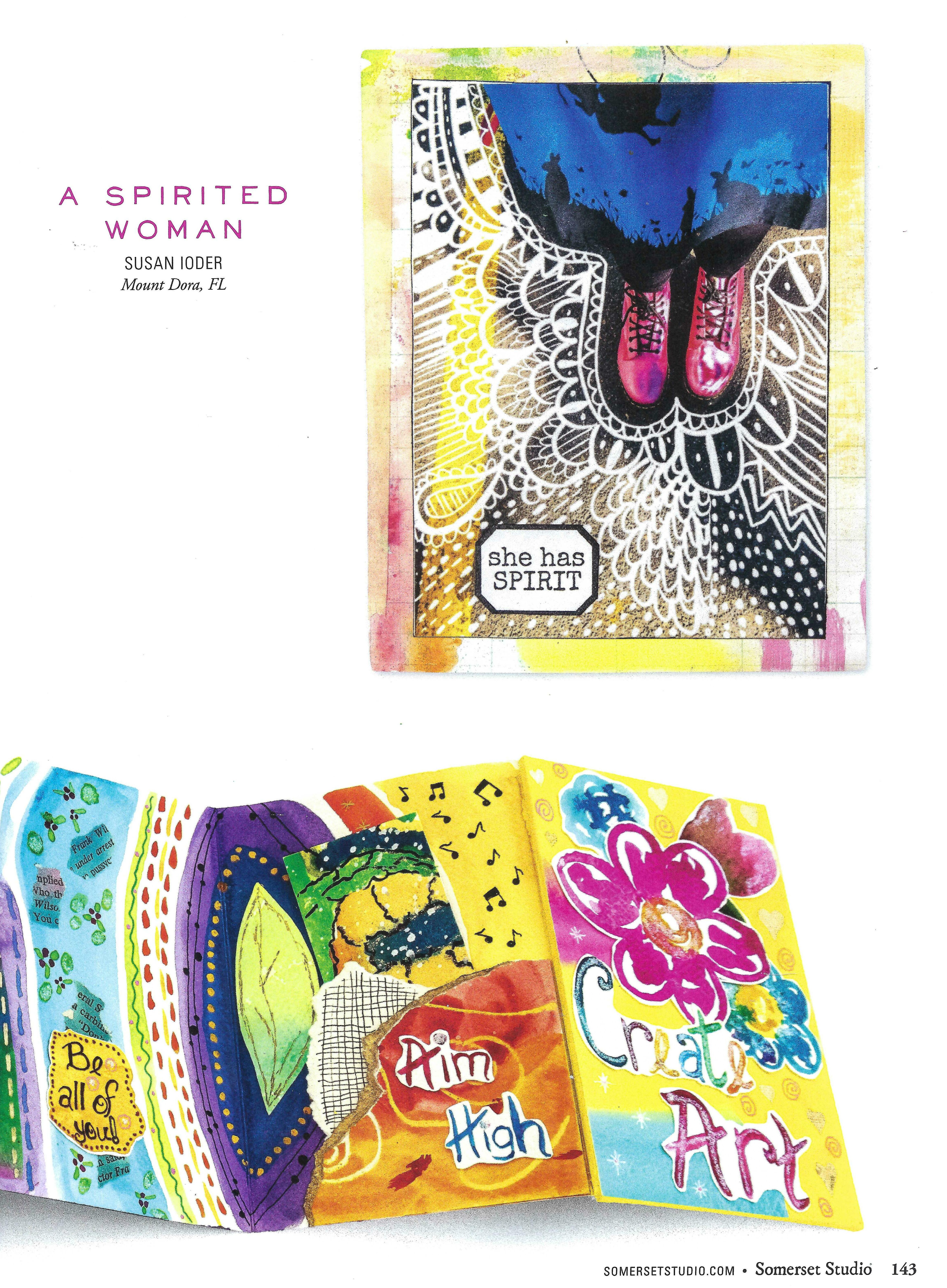
I have some exciting news to share with you. The other day while browsing in Barnes & Noble, I came across the latest issue of Stampington’s Somerset Studio Magazine. Late last year I submitted my accordion art journal for their “With Flying Color” Challenge, so imagine my surprise when I discovered that my piece received an honorable mention!
While I didn’t have an article published this time, photos of my art journal appear on pages 142–143, which was such a wonderful moment to see.
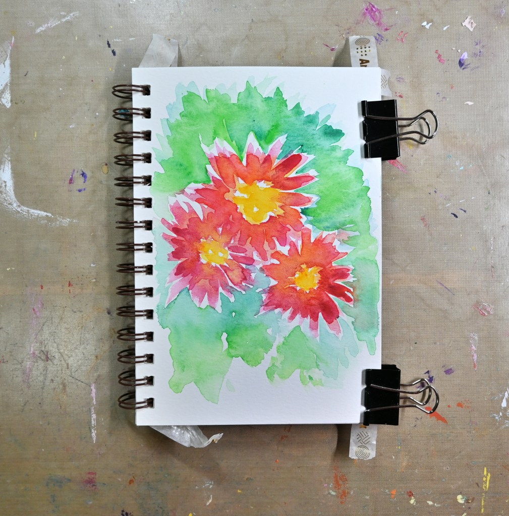
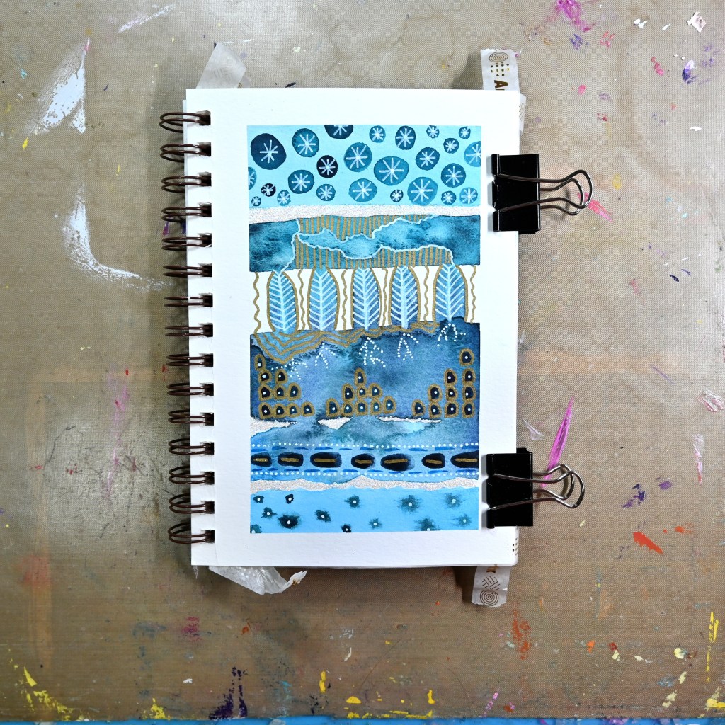
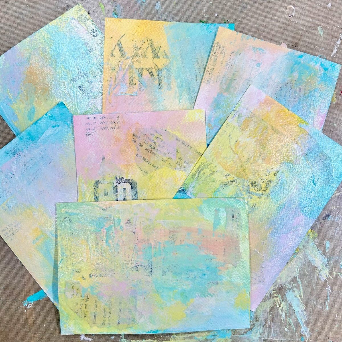
Sometimes creativity has a beautiful way of lifting our spirits, and seeing my journal in print thanks to Stampington Somerset Studio was such a bright moment this week—a wonderful reminder of the joy of creating.
This week has been an emotional one for me after losing my sweet Chanel just a few days ago. Seeing my colorful journal layout unexpectedly in the magazine felt like a little ray of light right when I needed it most. The happy colors and playful design instantly made me think of her and brought a smile to my heart.
Thank you so much for stopping by, and I hope you have a wonderfully creative weekend ahead! 🎨✨
Share the Happy💖