While I’m busy making little tweaks and fine-tuning my new Etsy Photography Shop, I’ve also been happily experimenting in the studio and diving into abstract work. Lately, it’s all about trying new techniques, playing with different supplies, and seeing what happens when I push myself outside my usual comfort zone.
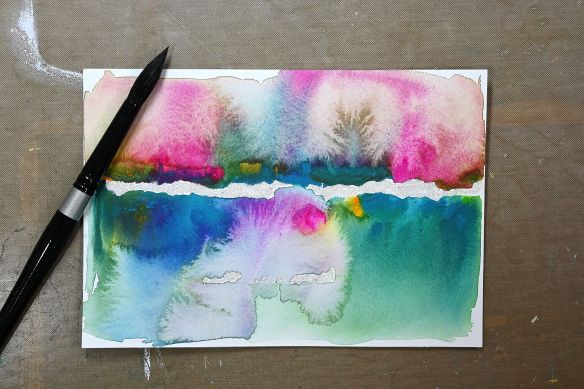
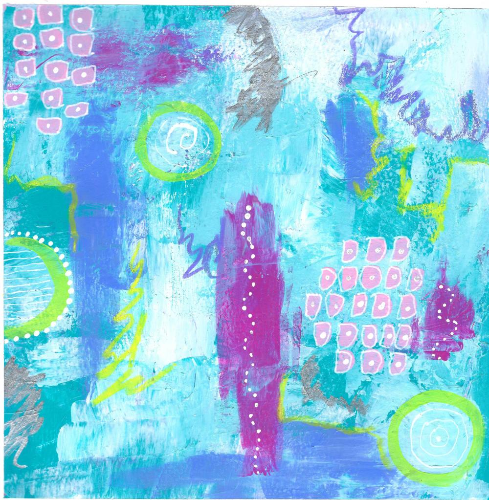
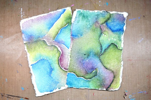
These pieces were created on 140 lb handmade watercolor paper—and I’ll be honest, it’s not my favorite. There are areas where the paint just refuses to soak in, no matter how much I layer it on. The paper also has a yellow-green tinge, which works beautifully with some color palettes… and not so much with others. Part of the process, right?
That said, I am absolutely loving this color palette. It has a cool, calming vibe that really speaks to me. In the first image, though, I wasn’t thrilled with how the paintings were coming together. I tried adding a touch of shimmering metallic paint to see if that would elevate them—but they still didn’t quite win me over.
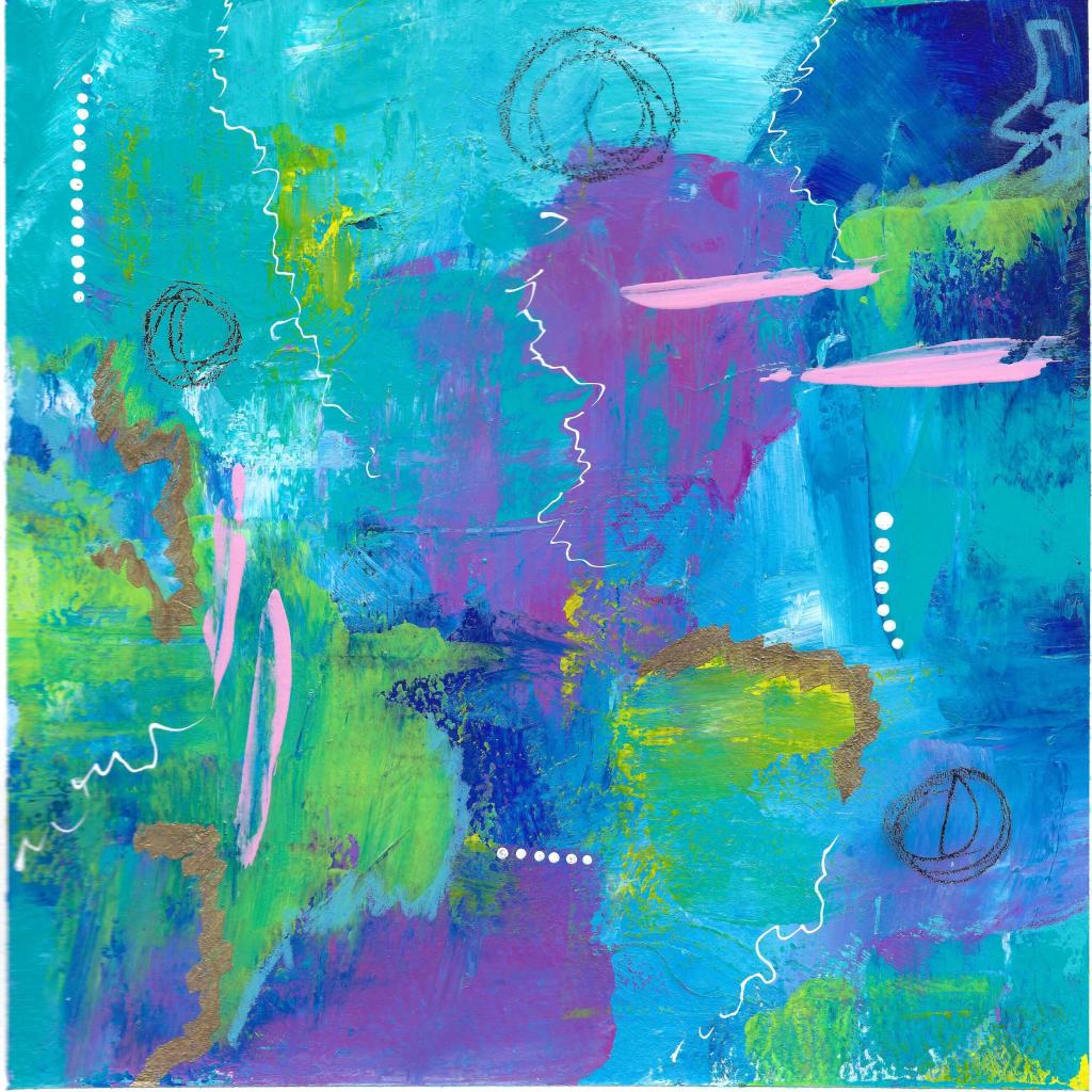
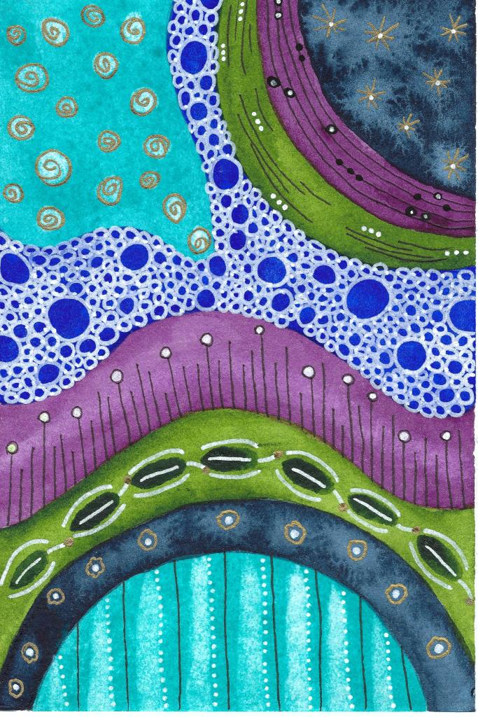
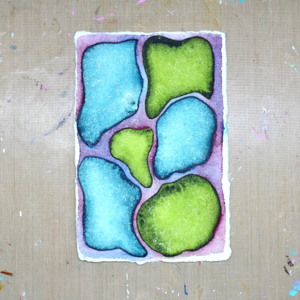
The second image features more organic shapes, and this is where things started to click. I love the way the shapes seem to glow, and that soft energy makes the piece feel really fun and alive to me.
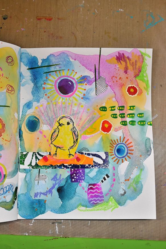
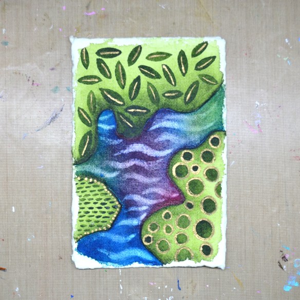
By the time I reached the last image, I pretty much threw everything in my creative arsenal at it—short of the kitchen sink 😉 That one I truly love, especially the way the gold paint catches the light and adds that extra glow.
Art is always an experiment, and not every piece needs to be a favorite to teach you something new—and that’s part of what keeps it exciting.
I also want to send warm wishes to everyone affected by Winter Storm Fern. I hope you’re staying safe, warm, and well.
Thanks so much for being here and sharing this creative journey with me. Have a wonderful day!
Share the Happy❤️