A Walk in Monet’s Garden: Observing the World Through Art

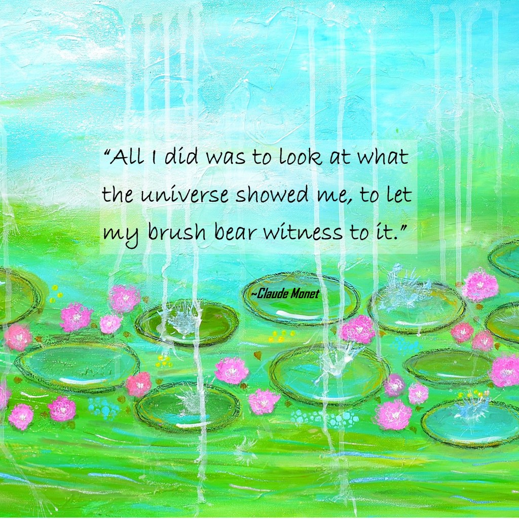
“All I did was to look at what the universe showed me, to let my brush bear witness to it.”
~ Claude Monet

When I came across this quote by Monet, it stopped me in my tracks. Such a simple thought, yet so deeply powerful. It reminds me that art isn’t always about striving or planning—it’s about noticing. Truly seeing. Allowing beauty to move through you and out onto the page, canvas, or journal.

Monet painted the world as he experienced it: shimmering light on water, the softness of morning mist, the dance of color in a garden alive with blooms. His work invites us not only to see, but to feel.

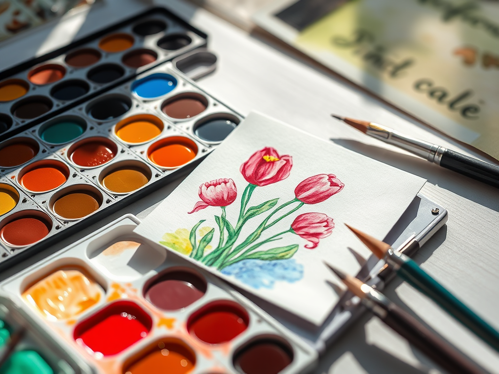
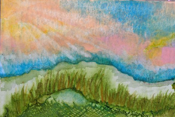
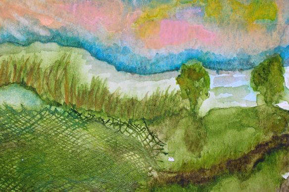
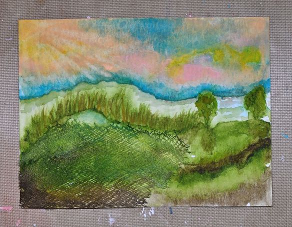
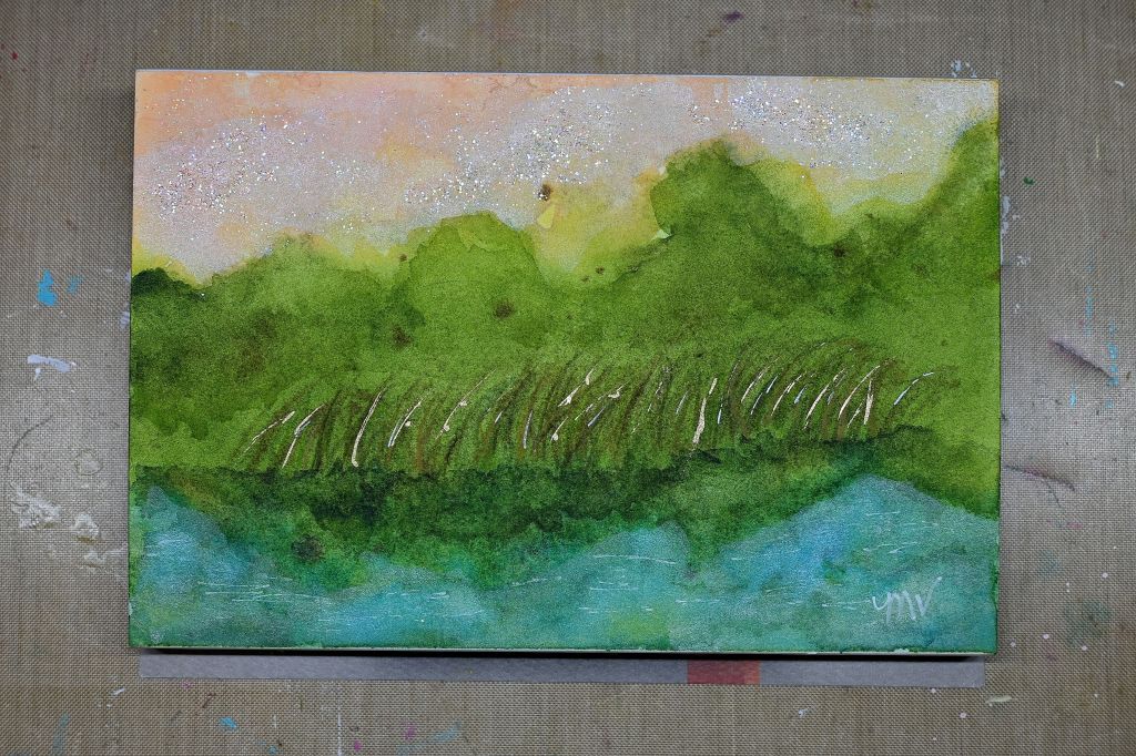
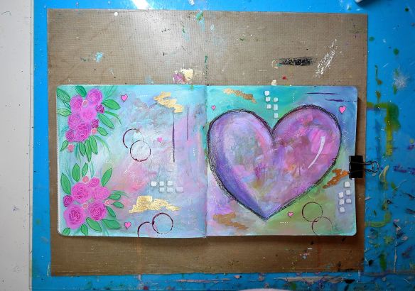
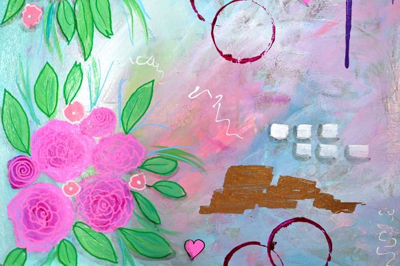
That’s the heart of my painting, “A Walk in Monet’s Garden.” It’s a gentle meditation on color and tranquility—a moment where I allowed myself to pause, observe, and let my brush bear witness, too. It’s not a replica of Monet’s style, but a reflection of the awe I feel when I slow down and look at the world with wonder.

Maybe today, you’ll take a quiet moment to do the same. Let beauty find you. Let it speak through whatever medium brings you peace.

Hope you enjoyed this today, thanks for stopping by!!

Share the Happy 💖

Watercolors vs. Gouache: Which Paint is Right for You?

Lately, I’ve been working on a small handmade journal, experimenting with both watercolors and gouache. Each medium has its own strengths, so I thought I’d share some of the perks and drawbacks of both. If you love painting, you’ve probably come across these two, and while they share similarities, their unique qualities can make a big difference in your creative process. Let’s dive into the pros and cons to help you decide which one suits your style best!

Watercolor

Pros:

  • Transparent & Layerable – Watercolors create beautiful, light washes and ethereal effects.
  • Fluid & Spontaneous – The paint flows naturally, making it great for loose, expressive work.
  • Lightweight & Portable – Perfect for travel and on-the-go painting.
  • Mixing Potential – Can achieve a wide range of colors with just a few pigments.

Cons:

  • Less Control – The unpredictability of water can be challenging to manage.
  • Lighter Colors Only – Once a dark color is down, it’s hard to lighten it.
  • Paper Dependent – Requires high-quality, absorbent paper for best results.

Gouache

Pros:

  • Opaque & Vibrant – Offers rich, bold colors with great coverage.
  • More Control – Doesn’t flow as much as watercolor, making details easier to refine.
  • Reworkable – Can be reactivated with water after drying, unlike acrylic.
  • Matte Finish – Gives a velvety, professional look, perfect for illustrations.

Cons:

  • Less Flow – Doesn’t have the same natural blending effects as watercolor.
  • Can Crack When Thick – If applied too heavily, it may crack when dry.
  • Not as Portable – Tends to be heavier and requires a palette for mixing.

Which One Should You Choose?

If you love soft, translucent layers and effortless blending, watercolor might be your best bet. If you prefer bold colors and a more forgiving medium, gouache is a great choice. Why not experiment with both and see what suits your style?

Which one do you prefer—watercolor or gouache? Let me know in the comments!

I hope you found this helpful—thanks for stopping by!

Share the Happy💖

The Magic of Layering: Creating Sunset Lake Scenes

I love experimenting in my abstract paintings, allowing each piece to evolve organically with textures, layers, and unexpected materials. Recently, I incorporated a unique twist into one of my works—a piece of cloth seamlessly blended into the paint. I didn’t have a set vision when I started, but as I layered colors and textures, something magical emerged.

Somehow, it transformed into a scene that reminds me of a sunset by the lake—a warm glow reflecting off the water, the sky shifting through soft gradients of color, and a sense of peaceful movement. That’s one of the things I adore about abstract art: the way it unfolds in unexpected ways, sometimes revealing emotions, memories, or entire landscapes you didn’t consciously set out to create.

This piece also reminded me why I love experimenting with different materials—whether it’s textiles, textured pastes, or metallic finishes, they add unexpected depth and intrigue. Pushing the boundaries of my work keeps the creative process exciting and full of discovery. I encourage anyone creating art to embrace playfulness, let go of expectations, and see where the materials take you.

But art is deeply personal, and the beauty of abstraction is that each viewer brings their own perspective. What do you see in this piece? A distant horizon? Gentle waves? A completely different story? I’d love to hear your thoughts in the comments!

✨ Wishing you a weekend filled with creativity, inspiration, and a touch of magic! ✨💫

Share the Happy 💖

Unique Techniques for Stunning Abstract Watercolors

Lately, I’ve been exploring new abstract designs, color combinations, and techniques to bring more depth and intrigue to my art. Some mediums have quickly become favorites, while others… not so much. But that’s the beauty of the creative journey—learning, experimenting, and discovering along the way!

One of the most magical parts of this process is working with watercolors. When creating these abstracts, you never quite know how the final piece will turn out. The paints mix and mingle in unexpected ways, forming unique colors and organic shapes that make each piece one of a kind.

This 4×6 inch watercolor abstract was an experiment with a new color combination that I instantly fell in love with. After the first layer dried, I built up the vibrancy with additional layers, enhancing the depth and shading. To finish, I added touches of gold pen and a bit of glitter for that extra magical glow. To me, it feels like a peaceful lake at sunset, with cattails swaying along the shore.

What do you see in it?

Wishing you a day filled with creativity, inspiration, and a little touch of magic! ✨

Share the Happy 💖

Create Vibrant Handmade Birthday Cards

There’s something magical about receiving a handmade card—especially one bursting with color, energy, and personality! Lately, I’ve been toying with the idea of creating an online class where we explore the joy of making vibrant abstract birthday cards together.

Imagine layering bold colors and playful textures to craft unique, artful cards that feel just as special as the people you’re celebrating. 🎨✨ Whether you love working with watercolor, acrylics, or mixed media, this class would be all about free-flowing creativity and embracing the unexpected.

Not only would these handmade cards add a personal touch to birthdays, but they’d also be a fun and relaxing way to tap into your artistic side. Plus, wouldn’t it be amazing to have a stash of beautiful, ready-to-gift cards on hand? 🎁💖

So, what do you think? Would you be interested in joining this class? 🤩 Let me know in the comments or send me a message—I’d love to hear your thoughts!

If this sounds like something you’d love, stay tuned for more details! 💬💛

Wishing you a fantastic weekend—thanks so much for stopping by! 😊✨

Share the Happy💖

Maximize Your Art Supplies: Creative Uses for Leftover Paint

Art supplies can be pricey, so I never like to waste any of them—especially paint. Instead of letting those last bits dry up on my palette, I use them to start a new journal page. It’s a simple but effective way to get the most out of your materials while keeping your creativity flowing. Even if you need to add a little more of certain colors, you’ll already have a great starting point without feeling like anything has gone to waste.

That’s exactly how I created this vibrant, abstract background. I applied the paint with a brush and also used my fingers to blend and add texture. There’s something so freeing about working with your hands—it creates a natural, organic feel that’s hard to replicate with a brush alone. Sometimes, I’ll wear a latex glove, depending on the medium, which helps keep my hands clean and prevents certain paints from staining.

Using up leftover paint like this isn’t just practical; it also sparks new ideas. A random splash of color can turn into an inspiring background for future layers—whether that’s collage, mark-making, or even a full painting. If you’ve ever hesitated before cleaning your brush or palette, try dabbing that extra paint onto a blank page instead. You might be surprised at the creative possibilities that unfold!

Do you have a favorite way to use up leftover paint? Let me know in the comments—I’d love to hear how you make the most of your supplies!

Thanks so much for stopping by! Wishing you a fantastic weekend filled with joy and creativity! 😊🎨✨

Share the Happy💖

P.S. I’m launching a new YouTube Channel where I’ll be sharing how-to and inspirational videos to ignite your creativity! If there’s something specific you’d love to see, let me know, and I’ll do my best to bring it to life. This is my very first upload—a short video as I get the hang of things—but stay tuned, because exciting content is on the way!

Valentine’s Day Art: Love is in the Air

With Valentine’s Day around the corner, love is truly in the air, and I’m thrilled to share my newest paintings with you: “Love is in the Air” and “Love in Motion!” 💕✨

Both of these heartfelt pieces were created on 8×8-inch canvases, featuring richly textured backgrounds that add depth and dimension. Layers of vibrant color, shimmering gold accents, and a touch of glitter make these paintings truly come alive—each brushstroke capturing the joy, movement, and magic of love. Whether you’re looking to brighten your space or searching for the perfect gift, these pieces radiate warmth and happiness. 💖

Take a moment to visit my Etsy Shop, where you’ll find these original paintings alongside other vibrant works of art. Each piece is a celebration for your walls, bringing color, creativity, and uplifting energy into your home.

Wishing you a day filled with inspiration, creativity, and love.

Share the Happy💖

Discover the Magic of Spontaneity in Art

Do you ever start a project with one idea in mind, only to watch it take on a completely different direction? That’s exactly what happened in my latest art journal layout!

I began with a loose, abstract background and added some handwritten thoughts. Layers of acrylic inks came next, creating rich textures and pops of color. It felt fun and free, so I kept building—adding more layers with acrylic paint and pens to deepen the design.

Then, something magical happened. As I worked, shapes started to appear. Before I knew it, a big pink heart and delicate flowers seemed to bloom right out of the page! 🌸💕

It wasn’t planned, but sometimes that’s the beauty of art. Creativity has a way of leading you where it wants to go. This spontaneous burst of love-filled energy reminded me how important it is to stay open to the unexpected. When we let go of rigid expectations, beautiful surprises emerge.

What can I say? I’m definitely in love mode today! 💖

I hope this journal spread inspires you to embrace happy accidents in your creative practice, too. After all, art is as much about the journey as the final result—and there’s so much joy to be found when we allow the process to flow.

I’d love to hear how your creative projects have taken unexpected turns! Share your experiences or artwork inspired by this post in the comments, or tag me on Instagram @flowingwatersart. Let’s inspire each other and celebrate the beauty of creativity!

Wishing you a weekend filled with love, creativity, and a touch of magic!

Share the Happy! 💖

Shop Vibrant Mini Abstract Art for Joyful Home Decor

I’m so excited to share something new with you today—my latest mini abstract painting is now available in my Etsy Shop!

This mini 3×5-inch treasure is packed with personality. Its textured background is alive with vibrant pink, white, and beige acrylics, while blue, purple, and gold accents add pops of interest and depth. And of course, I couldn’t resist a bit of glitter to sprinkle in some extra magic! ✨

Whether you’re looking for a cheerful touch for a cozy corner or a unique, handmade gift for someone special, this little gem is designed to bring warmth and joy.

What’s the tiniest piece of art you’ve ever created? I’d love to hear all about it! Share your story in the comments—I’m always inspired by the creative ways we bring art into our lives and spaces.

Thank you for being such an important part of my creative journey—your encouragement and support truly mean the world to me! I hope this mini burst of happiness brings a spark of joy to your day.

Share the Happy💖

Creative Journal Layouts with ArtFoamies

This holiday season, I treated myself to ArtFoamies—chunky, foam stamps that offer endless creative possibilities! They work beautifully with acrylics, inks, and more. Since each order is custom-made, it took a little time to arrive, but it was worth the wait!

Browsing their website felt like being a kid in a candy store—so many fun designs! 😂 After much debate, I picked a variety of stamps I can’t wait to share in future projects.

First Creation
For my first journal layout, I used a stunning design by Gina Aherns (@ginabahrens) featuring three elegant women, perfect for my 9×12-inch Strathmore Mixed Media Visual Journal (photos below!).

I started with handwritten text on the background, softened it with acrylic paint, then added a swirl stencil for extra texture. Stamping with watered-down white acrylic paint got a bit messy (oops!), but I love the perfectly imperfect result! Highlights and shading added dimension, bringing the piece to life.

I finished with a handwritten quote that resonates deeply with me:
“Rejoice in your journey! The good & bad have all shaped your character and given you strength. Rejoice!!!”

This page was a joy to create, and I’m already dreaming up new ways to use these stamps. Now, it’s your turn! What new creative tools or techniques have you tried recently? I’d love to hear all about your favorite discoveries—let’s inspire each other to keep creating magic!

Wishing you a weekend full of inspiration, joy, and creative adventure! 🌟💛

Share the Happy💖