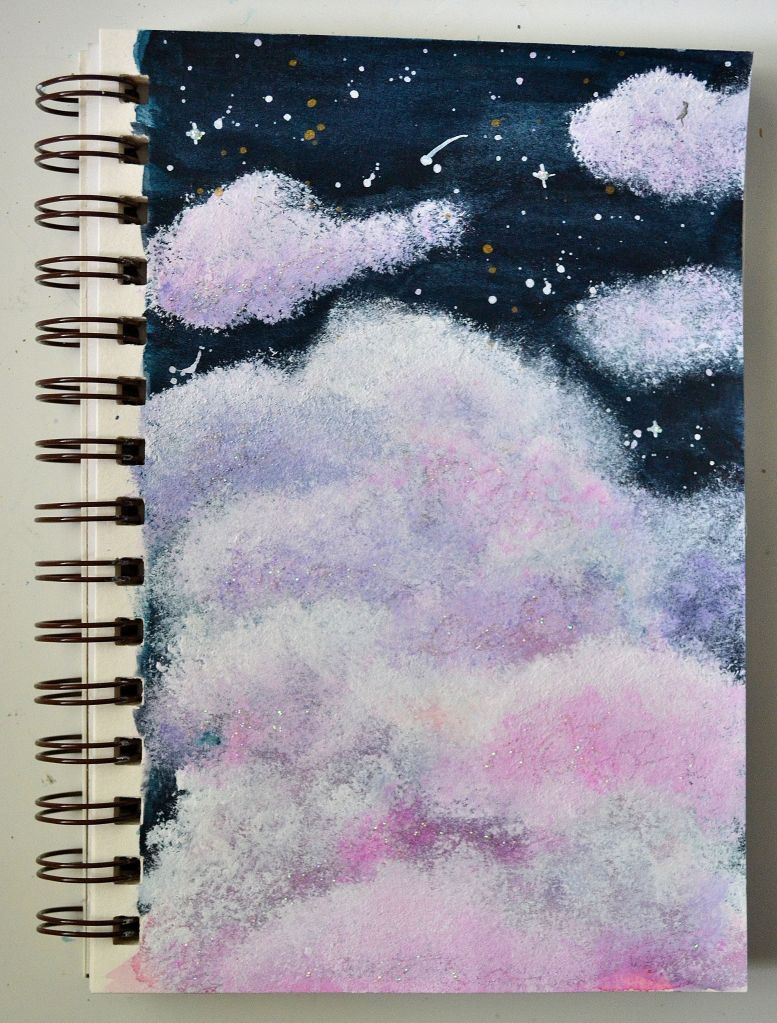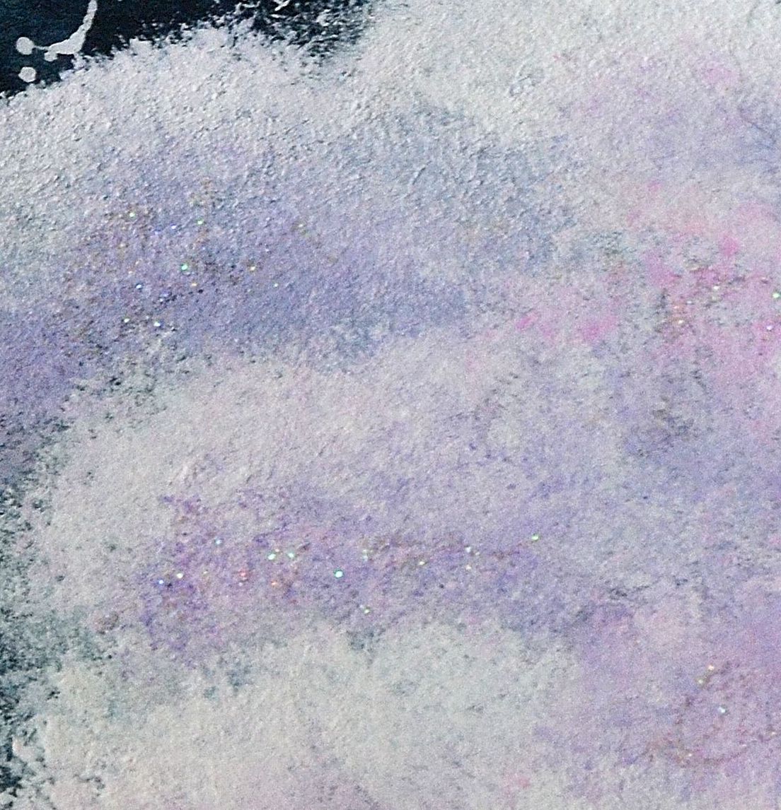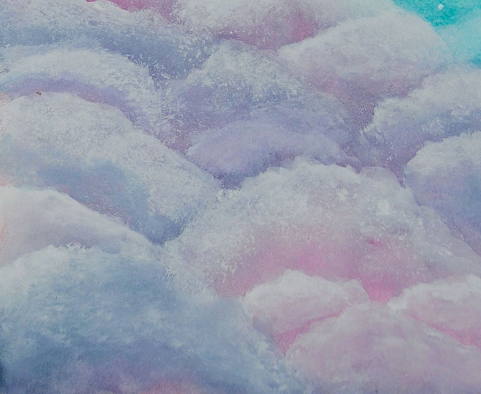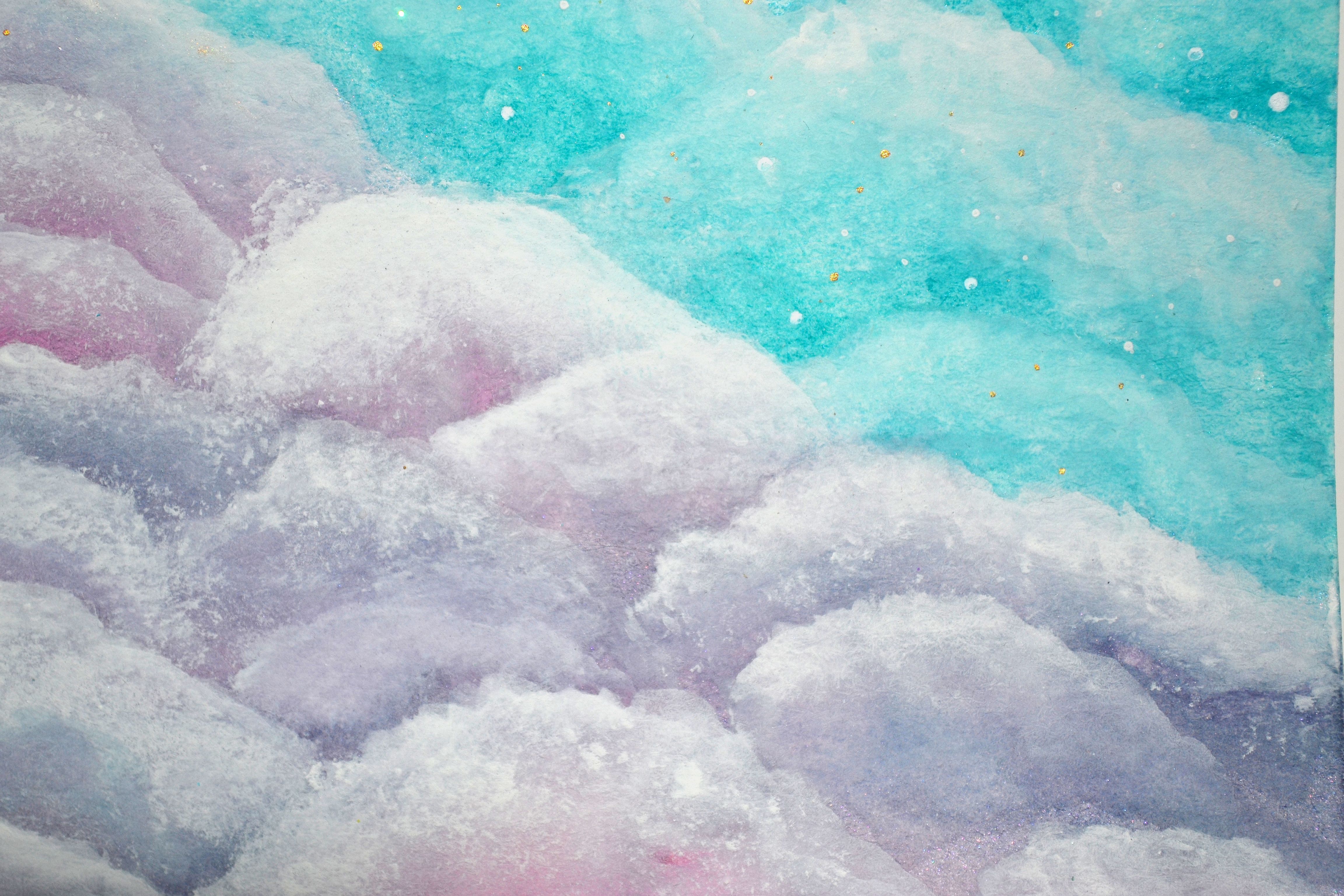
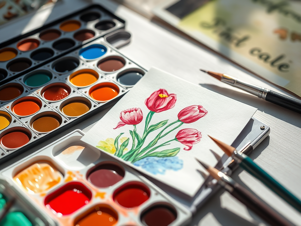
Lately, I’ve been working on a small handmade journal, experimenting with both watercolors and gouache. Each medium has its own strengths, so I thought I’d share some of the perks and drawbacks of both. If you love painting, you’ve probably come across these two, and while they share similarities, their unique qualities can make a big difference in your creative process. Let’s dive into the pros and cons to help you decide which one suits your style best!
Watercolor
Pros:
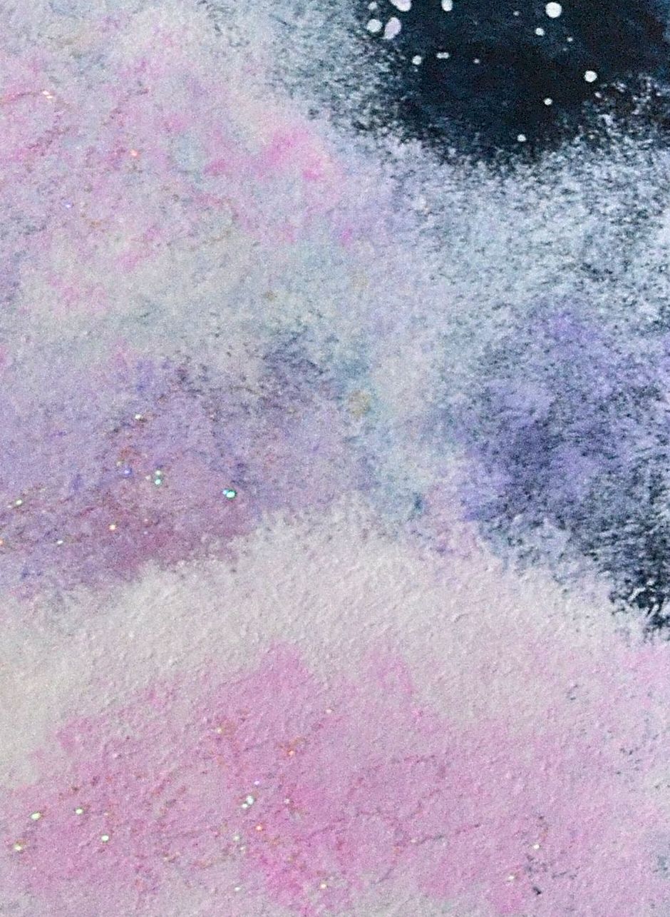
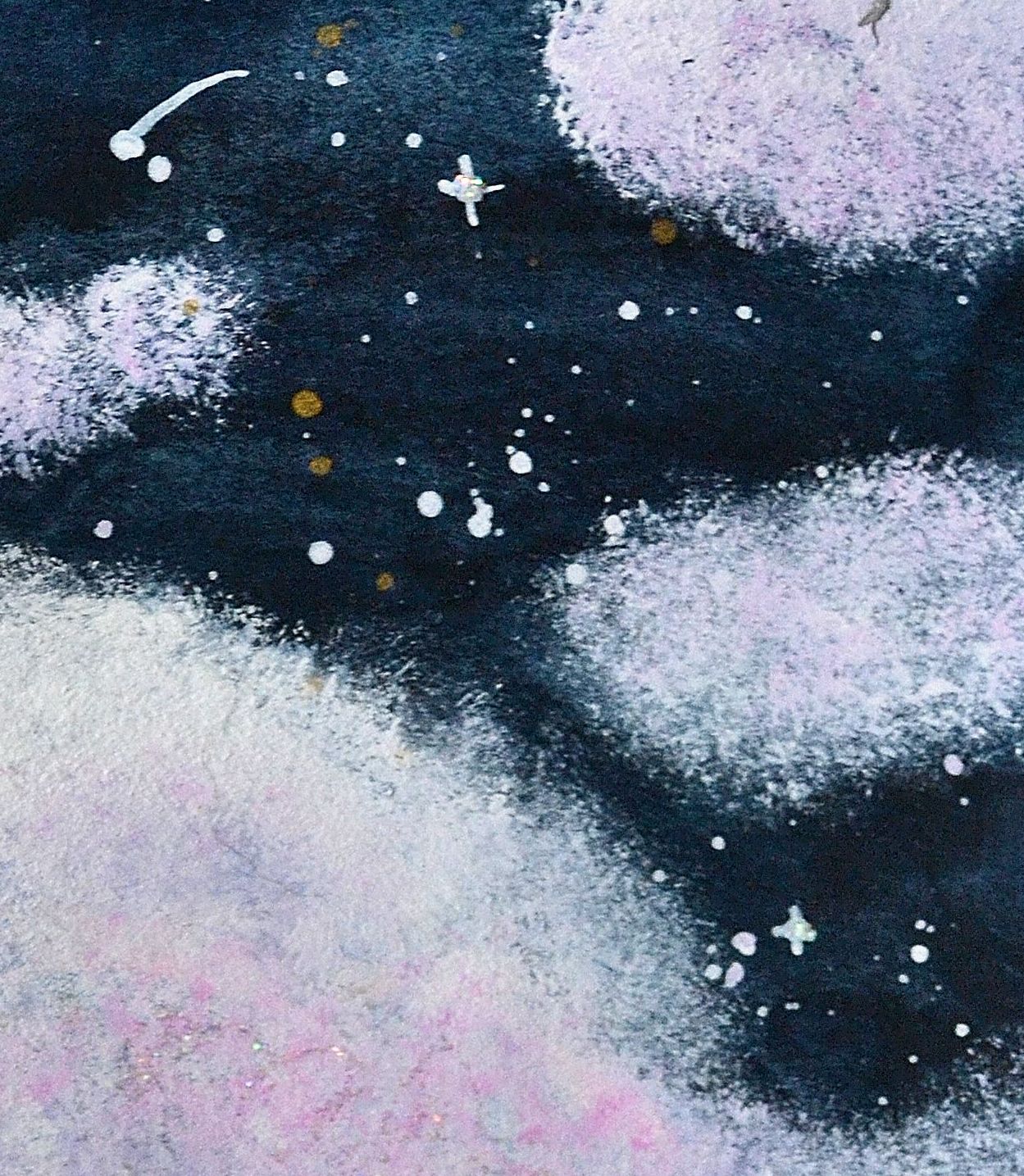
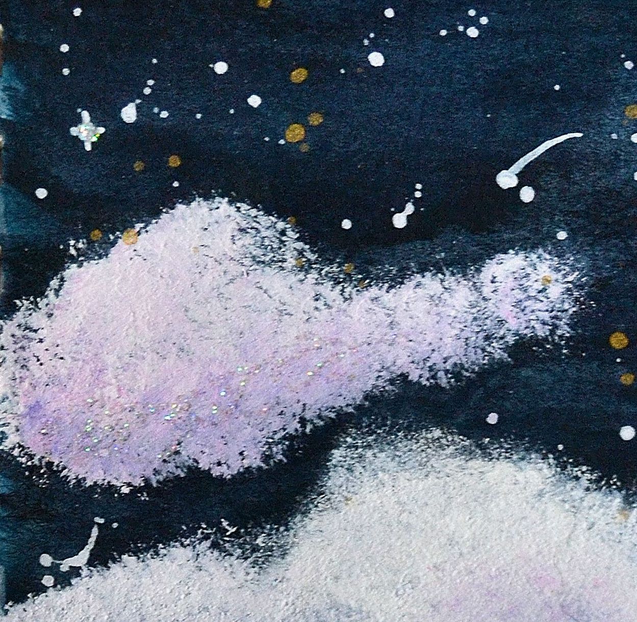
- Transparent & Layerable – Watercolors create beautiful, light washes and ethereal effects.
- Fluid & Spontaneous – The paint flows naturally, making it great for loose, expressive work.
- Lightweight & Portable – Perfect for travel and on-the-go painting.
- Mixing Potential – Can achieve a wide range of colors with just a few pigments.
Cons:
- Less Control – The unpredictability of water can be challenging to manage.
- Lighter Colors Only – Once a dark color is down, it’s hard to lighten it.
- Paper Dependent – Requires high-quality, absorbent paper for best results.
Gouache
Pros:
- Opaque & Vibrant – Offers rich, bold colors with great coverage.
- More Control – Doesn’t flow as much as watercolor, making details easier to refine.
- Reworkable – Can be reactivated with water after drying, unlike acrylic.
- Matte Finish – Gives a velvety, professional look, perfect for illustrations.
Cons:
- Less Flow – Doesn’t have the same natural blending effects as watercolor.
- Can Crack When Thick – If applied too heavily, it may crack when dry.
- Not as Portable – Tends to be heavier and requires a palette for mixing.
Which One Should You Choose?
If you love soft, translucent layers and effortless blending, watercolor might be your best bet. If you prefer bold colors and a more forgiving medium, gouache is a great choice. Why not experiment with both and see what suits your style?
Which one do you prefer—watercolor or gouache? Let me know in the comments!
I hope you found this helpful—thanks for stopping by!
Share the Happy💖