Thoughtful Thursday – How Color Affects the Mind

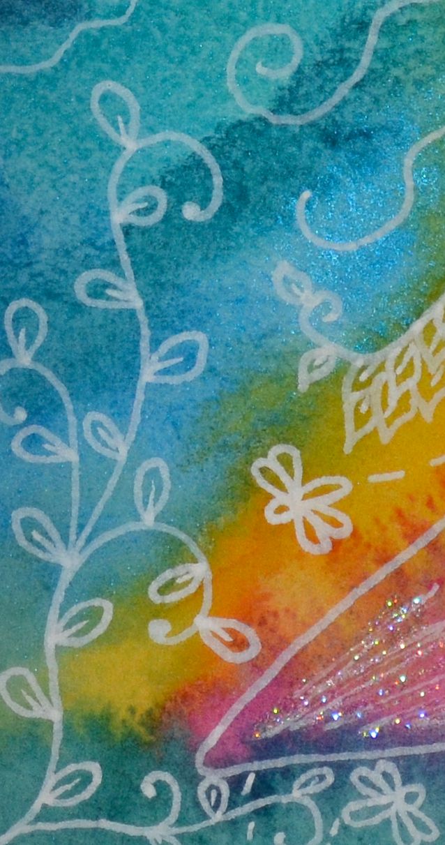
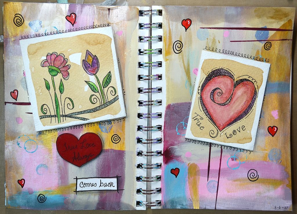
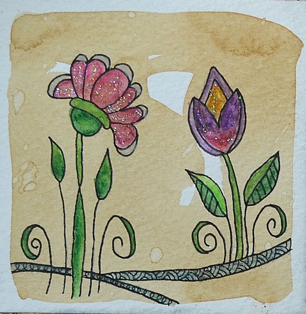
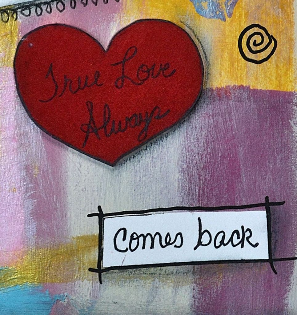
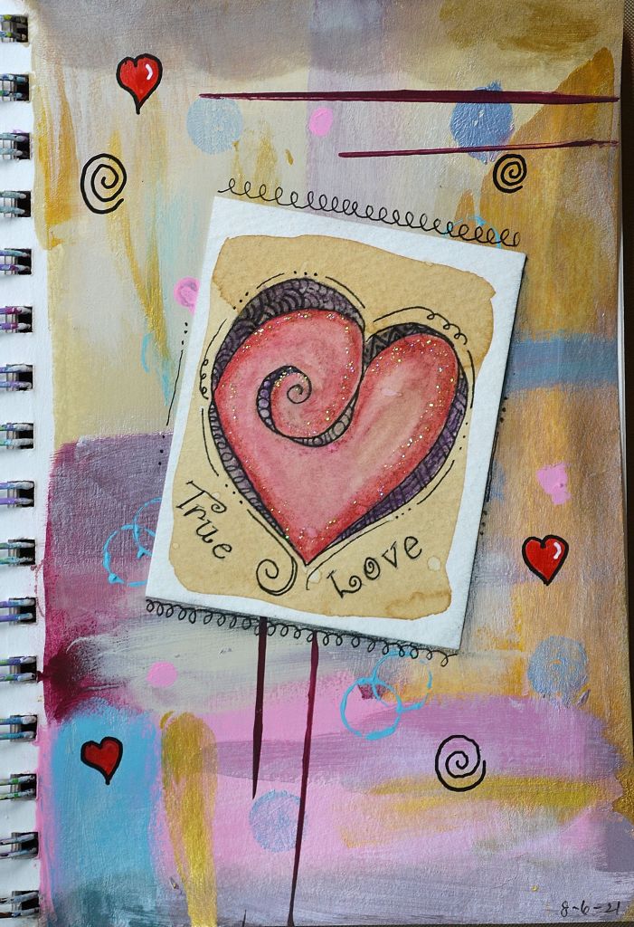
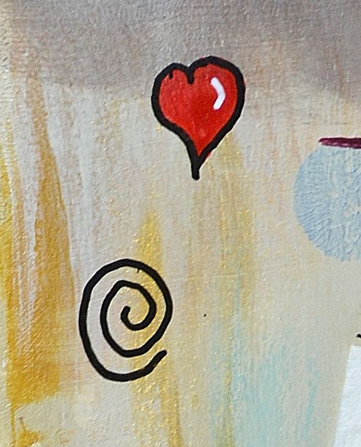
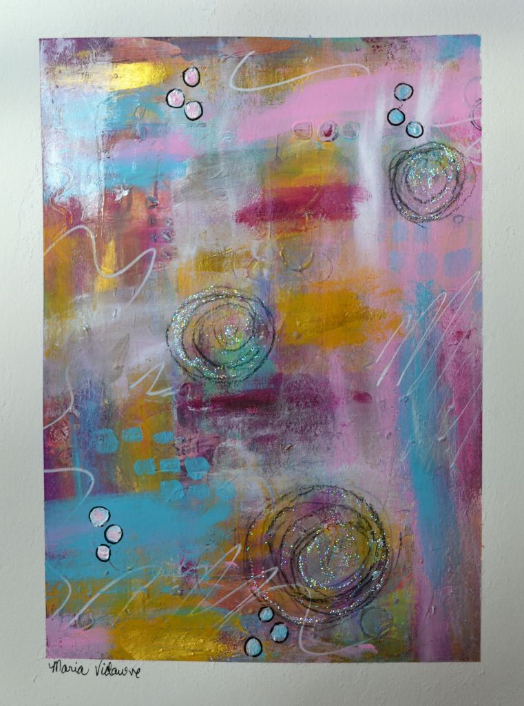
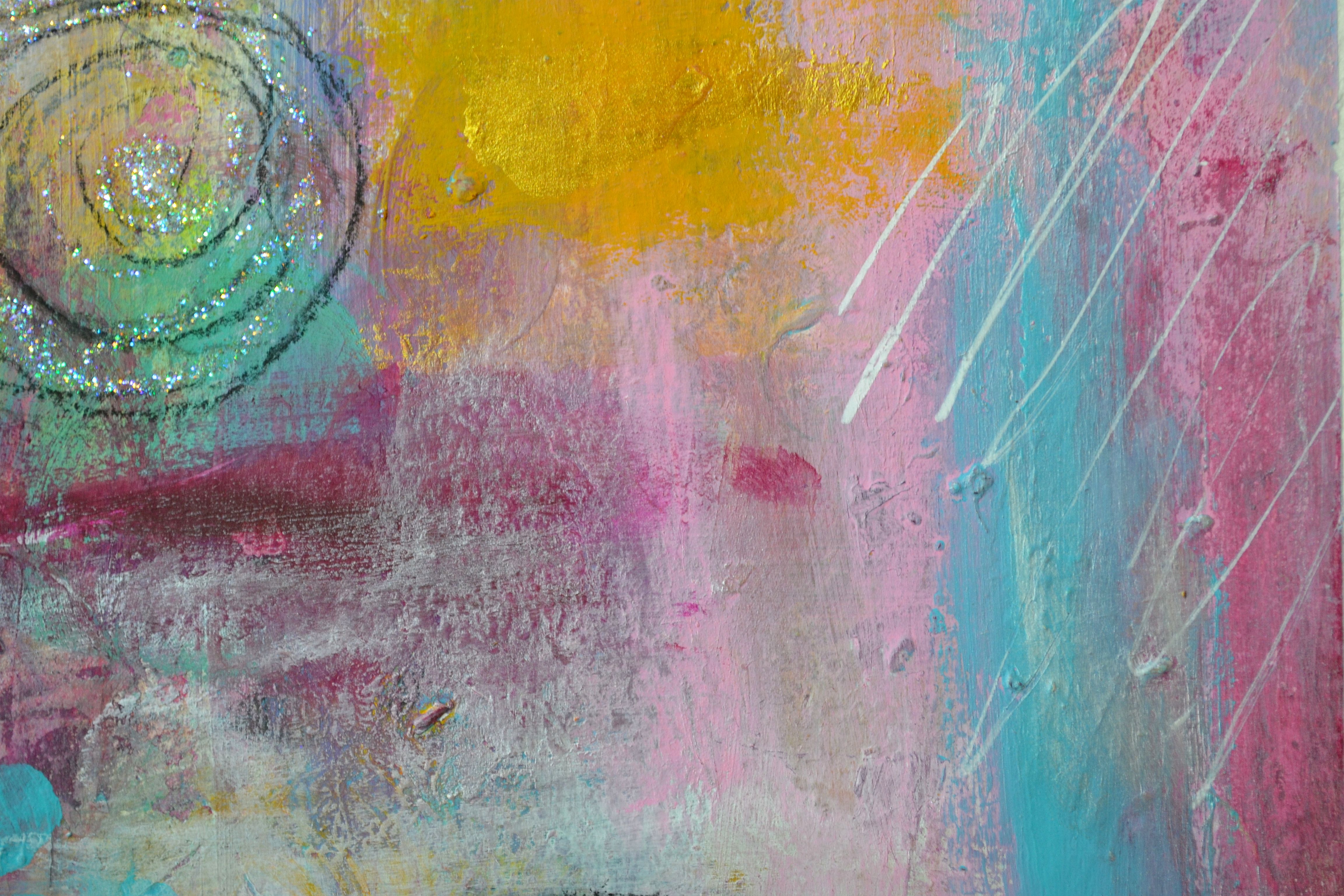
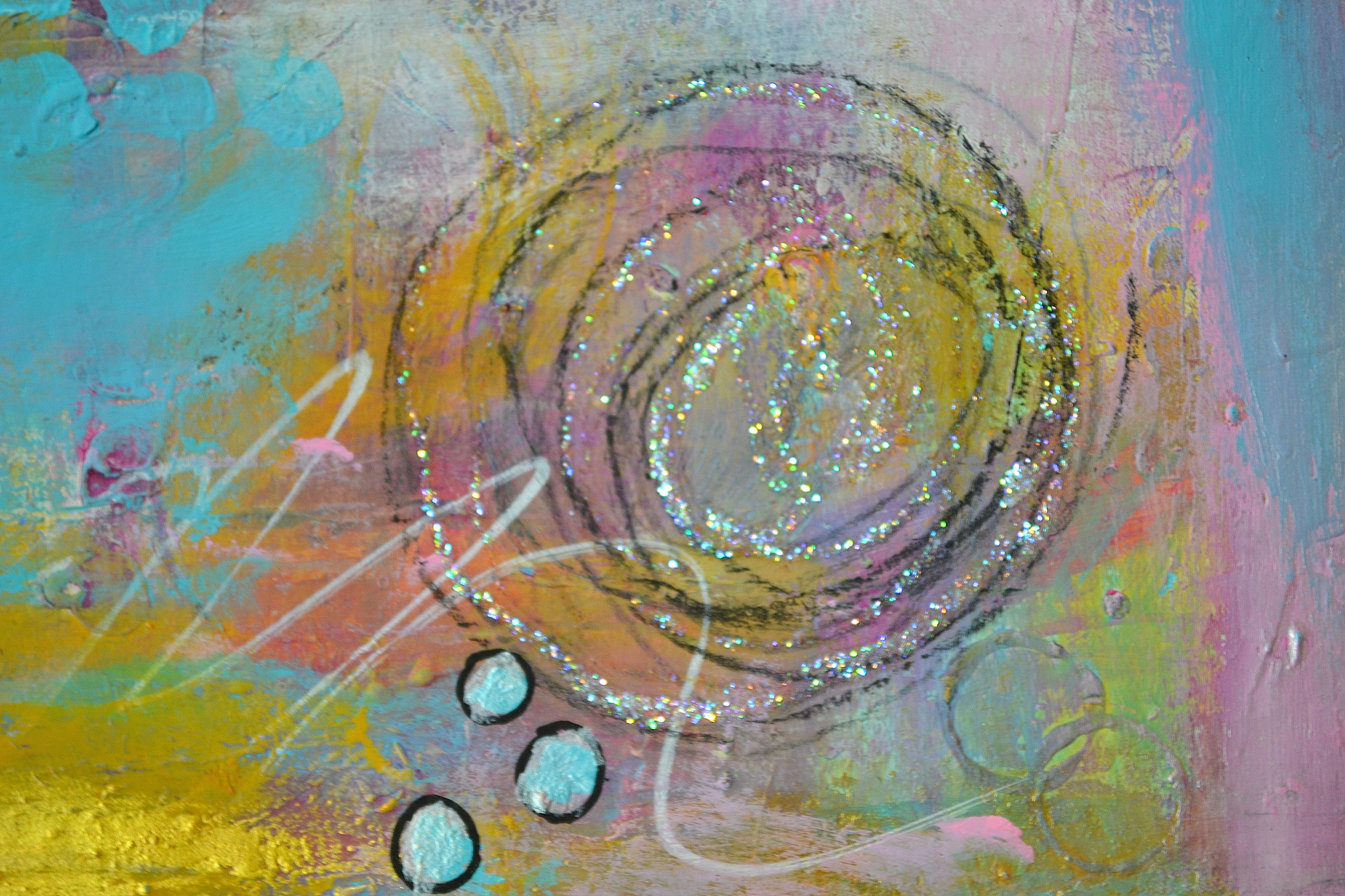
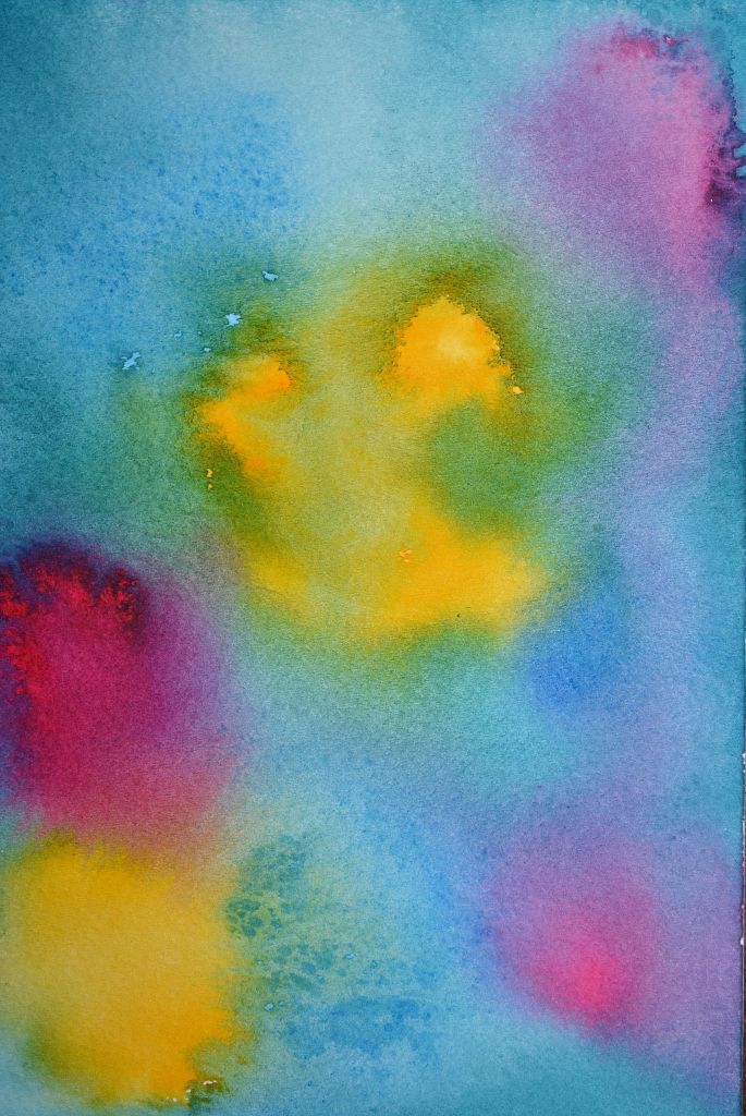
This was a watercolor painting I created as a background for an inspirational quote that I’ll be adding to it. It’s made with bright, fun, happy colors. At least that’s what I intended for the viewer to feel. What does it make you feel?

Color is amazing in the power it has in the mind and it’s affects on how you feel. A painting can be pleasing to look at, or not depending on the colors used. Some colors make you feel happy while others make you sad or depressed. Colors can even impact your shopping and hunger pangs.

Have you noticed how a lot of restaurants and fast food chains use red and yellow in their branding? It’s no mistake, it all comes down to psychology. Red has a tendency to make you feel hungry. While yellow tends to make you feel happy. When you see these colors while driving, you may pull in for a quick bite to eat even though you’re not necessarily hungry. So it’s no wonder that this is a popular color combination for them.

Blue can evoke feelings of serenity and trustworthiness and purple evokes feelings of luxury and romance, while pink is associated with femininity and innocence. I can go into great more detail about color but I think this gives you a pretty good idea of how it affects our minds. So stop and take notice of how you feel when you see certain colors.

Speaking of colors, Jodi Ohl a very talented mixed media artist is hosting a Color Lovers Challenge. It started yesterday and runs until October 15. Every day you have a new prompt to create a piece of art of any kind, no rules using colors of your choice. The link to the list of prompts can be found on her Color Lovers Challenge page. I entered and will be posting my creation for yesterday shortly on this blog, so stay tuned.

Would love to see you join and have some fun!

Thanks for stopping by!

Share the Happy 💖

“I found I could say things with color and shapes that I couldn’t say any other way.” ~Georgia O’Keeffe

True Love Art Journal Page (Part 2)

Last week I shared Page 1 of my journal with you. I had a lot of fun making these tiles using coffee as the background. This flower tile is slightly bigger than the other one as it’s a full 3″ square.

I loved creating with Shrinky Dinks when I was a kid. So I found this heart that I had made quite some time ago and thought it went well with the page as I made it part of the quote “True Love Always comes back.”

Supplies

  • Watercolor Paper, 140lb, Cold Press
  • Micron Sakura Pen 003
  • Assorted Bright Watercolor Pencils
  • Coordinating Acrylic Paints
  • 1 Cup of Coffee
  • Ephemera/Embellishments of your choice
  • Posca Pens: White and Black
  • Pencil for shading

Instructions

  1. Make a cup of really strong dark coffee.
  2. Cut your watercolor paper to the desired size.
  3. Using the Coffee, paint your watercolor paper. Let dry.
  4. Paint the pages in your journal with acrylic paints, let dry.
  5. Using your watercolor pencils, draw and color in your design. Activate the colors with a little water but try not to over mix the colors. Let dry.
  6. Using the Sakura Micron 003 Pen outline your design on your tile and glue it to your page.
  7. Add doodles, embellishments and ephemera to pages.
  8. Add shading with a pencil and highlights with the Posca pen.

Thanks for stopping by!

Share the Happy!!

True Love Art Journal Page (Part 1)

I have a tendency to make little pieces of art, then put them away until I’m ready to use them. I read an article where they made art using coffee. I’m not a coffee drinker but I do love the smell of coffee so I decided to give it a whirl.

I used watercolor paper for my 2.75″ x 3.5″ tile so I could be heavy handed with the coffee and get a nice background color. The trick is to make really strong, dark coffee then paint your paper.

Once the coffee is dry, you can create your art. I used watercolor pencils to make my drawing and activated the colors with water. After the paint dried, I went back over my drawing with Sakura Micron Pen 03. As always, I couldn’t resist adding that little bit of sparkly magic with glitter to the tile. (Note: When painting your tile, don’t be afraid to go bold and bright with the watercolor paints because they become muted and toned down when the colors mix with the coffee.)

For this journal page I used my Strathmore 5.5″ x 8″ Mixed Media Journal. I started by putting a good coat of gesso on my page and let it dry. Next, I used assorted acrylic paints that blended with the tile but at the same time made it stand out. After I was happy with the page, I glued my tile in place, added a few doodles and that was it.

I’ll post the second page of this layout next week so stay tuned as the adventure continues!

Thanks for stopping by!

Share the Happy!!

Abstract Mixed Media

I participated in a free online class over the weekend in Art is Magic where they offer a year long mixed media course taught by 28 artists. This class was a preview of what is available in the full course.

Jodi Ohl a very talented artist, taught this class. I’ve tried abstract art before, thinking it was easy and it so wasn’t. Not to mention, I never liked what I created and would always just reuse that piece of art in other projects. This is the first abstract I created that I actually like and I’m happy to say it will not be recycled, lol.

Creating this was using new techniques was challenging and quite an adventure. So a BIG thank you to Jodi for making it so much fun!

Wishing you a wonderful week ahead.

Thanks for stopping by!

Share the Happy!!